Cafe Packaging Ideas That Enhance Your Brand
Packaging does quiet work in a cafe. It carries hot drinks without leaking, keeps pastries intact, and helps the lunch rush move faster. Yet its bigger job is often missed. Packaging is one of the few branded touchpoints a customer takes away. A cup leaves the counter and travels through streets, offices, cars, and apartment lobbies. A pastry box lands on a conference table. A takeaway bag sits on a passenger seat beside someone who may come back tomorrow if the experience felt considered.
That is why good cafe packaging is rarely just a purchasing decision. It is a brand decision, an operations decision, and often a margin decision too.
The strongest packaging systems do three things at once. They make the cafe easier to run, they make the product feel worth its price, and they reinforce the kind of place you want customers to remember. That might mean polished minimalism for a high-volume urban coffee bar, warm tactile materials for a neighborhood bakery cafe, or practical reusable formats for a sustainability-led concept. There is no single right answer. There is only the version that matches your service style, your price point, and the story your space already tells.
Packaging is part of the menu experience
Customers rarely separate packaging from product. If the lid pops off, the espresso tastes less premium. If a croissant arrives crushed in an oversized box, the bakery loses some of its craft credibility before the first bite. If an iced latte is handed over in a cup that looks generic and flimsy, the customer may still enjoy it, but the memory becomes less distinct.
This is especially true in cafe settings because price perception is fragile. Coffee and pastries often sit in a zone where the ingredients alone do not explain the final price. Customers pay for convenience, atmosphere, consistency, service, and yes, presentation. Packaging acts as proof that care was applied beyond the recipe.
I have seen independent cafes spend months refining their interior, menu typography, and pastry display, then buy plain stock packaging in a rush just before opening. The result feels disjointed. A thoughtfully designed room hands over a cup that could have come from anywhere. Customers notice that disconnect even when they cannot articulate it.
Brand-enhancing packaging closes that gap. It extends the space beyond the counter.
Start with the brand you actually run, not the one you imagine
A common mistake is choosing packaging that looks aspirational but does not fit the business on a busy Tuesday morning. Matte black cups with delicate foil logos may look beautiful in mockups, but they scuff, cost more, and slow restocking if your team manages four milk options, two cup sizes, and a steady stream of delivery orders. On the other hand, a cheerful printed bag might suit a lively family-focused cafe better than a stark luxury treatment.
Packaging works best when it expresses the real operating personality of the cafe. Ask practical brand questions, not abstract ones. Are you fast and high-energy, or slow and craft-led? Do customers linger, or is takeaway a major revenue stream? Are you trying to feel premium, approachable, eco-conscious, playful, or quietly refined? Your answers should influence every packaging choice, from material to copy tone to color density.
A cafe near a train station may need cups that communicate clearly from a distance, with bold logos and easy size recognition for repeat commuters. A destination brunch spot may benefit more from pastry boxes and sandwich wraps that photograph well and protect presentation during a twenty-minute ride home. A tiny specialty coffee counter might put most of its budget into cups and bean bags because those do the heaviest brand lifting.
The best packaging ideas usually begin with one signature element
Not every cafe needs custom printing on everything. In fact, too many branded elements can make a small brand feel noisy. Most successful systems rely on one or two memorable cues repeated consistently. That cue could be a color, a line illustration, a stamp, a pattern, a phrase, or a material finish.
Think of the cup sleeve with a tactile kraft texture and a clean dark green mark. Think of the pastry bag with a small repeating icon that customers start associating with morning routine. Think of the bean label that uses the same typography as the menu board. These are modest moves, but repeated often enough, they become brand memory.
For cafes with tighter budgets, the smartest approach is usually to invest in the packaging pieces customers carry furthest and handle most. That often means hot cups, cold cups, takeaway bags, pastry bags, and labels. Napkins, cutlery sleeves, and tissue paper can wait if funds are limited. A well-designed sticker applied consistently can do more brand work than a dozen lightly customized items that never appear in the same order.
Cups deserve more attention than they usually get
The takeaway cup is the ambassador most cafes rely on and under-design. It needs to hold temperature, resist leaks, stack neatly, and look good in a customer’s hand. It also needs to stay legible under real conditions, with condensation, sunlight, crowded counters, and half-distracted baristas.
Paper cup color matters more than many owners expect. White reads clean and modern, but can feel generic unless the graphic treatment is confident. Kraft looks grounded and natural, though it can lean overly rustic if the rest of the cafe is sleek. Dark colors can feel premium, but fingerprints, scratches, and milk drips show quickly. Soft neutrals often age better than trendy shades, especially if you are ordering large quantities.
Lids matter just as much. A beautiful cup paired with a flimsy lid creates instant disappointment. Customers forgive many things, but they remember spills. If your menu includes a lot of oat milk cappuccinos or larger specialty drinks, test lid fit under rush conditions, not just at a quiet desk. Teams often discover problems only when cups are moving fast and hands are wet.
Sleeves offer another branding opportunity. For many cafes, a custom sleeve is more cost-effective than a fully custom cup, especially when seasonal flexibility matters. A sleeve can carry the logo, social handle, a short message, or even rotating artwork from local artists. This works particularly well for neighborhood cafes that want to feel connected to place rather than purely polished.
Food packaging should preserve texture, not just shape
Coffee gets attention, but food packaging often determines whether customers reorder. A toasted sandwich trapped in the wrong wrap goes soggy. A frosted cake slice loses its finish in a low wall box. A flaky pastry packed while too hot steams itself soft before the customer arrives.
Good cafe packaging protects texture and timing. Vented boxes can help warm baked goods breathe. Grease-resistant wraps preserve hand feel without feeling plasticky. Sandwich clamshells need enough structure to prevent compression but not so much depth that product shifts during transport. For delicate items, inserts can make sense even in small operations if premium desserts are a high-margin category.
Brand enhancement comes from solving these tactile problems elegantly. Customers do not say, “What a well-ventilated pastry bag.” They simply feel that your food travels well, which makes your brand seem more competent and more worth recommending.
This is one area where field testing pays off quickly. Pack the item as a customer would receive it, wait fifteen minutes, then open it and assess texture, aroma, and appearance. I have watched cafes switch from one wrap to another and cut complaints dramatically, not because the recipe changed, but because the crust stayed crisp and the sauce stayed in place.
Small details signal a serious brand
Luxury in a cafe does not always come from expensive materials. It often comes from restraint and consistency. A clean label applied straight. A sticker that tears cleanly instead of curling. A pastry box sized properly so the item does not slide. Copy on the cup that sounds like the cafe, not like stock marketing language.
These details create confidence. They tell customers someone thought through the handoff, not just the sale.
Some of the strongest packaging upgrades are remarkably simple:
- Use one distinctive brand color across cups, labels, and bags.
- Create a clear sticker system for names, modifiers, and food categories.
- Print a short brand phrase that feels specific to your cafe.
- Choose one tactile material, such as uncoated stock or embossed labels.
- Size boxes and bags to your real menu, not a supplier’s default bundle.
None of these ideas require a dramatic redesign. They require discipline. That is usually the harder part.
Sustainability should be visible, but not preachy
Most customers care about waste to some degree, though they vary widely in how much it affects buying behavior. What consistently helps a cafe brand is showing practical environmental responsibility without turning every cup into a lecture.
Compostable, recyclable, or reusable packaging can support brand perception, especially for cafes whose audience expects it. But the claim only helps if the real-world system supports it. If the cup says compostable yet local composting is hard to access, customers may feel misled. If a reusable cup discount exists but staff forget to apply it, the effort loses force.
The better approach is honesty and clarity. If your lids are recyclable in your city, say so briefly. If your takeaway bag is made from post-consumer content, mention it once on the base or side panel. If your cafe runs a returnable cup pilot, make the instructions obvious and friction-free.
Sustainability can also appear through design choices that reduce excess. An intelligently sized bag uses less material and feels more refined. A universal label system cuts waste from obsolete pre-printed stock. A cup design that works year-round avoids seasonal leftovers that never get used up.
Customers can tell the difference between a considered system and green-colored branding that means very little.
Custom packaging is not always the first smart move
Many cafe owners assume brand-enhancing packaging means fully custom everything from day one. That can be expensive, slow, and difficult to adjust if menu mix changes. Minimum order quantities often force young businesses into storing more stock than they can reasonably use, especially if they are still refining sizes and product formats.
There is a practical middle ground. Start with strong stock packaging and customize selectively through sleeves, labels, stamps, or stickers. This allows you to test response, train staff, and maintain flexibility. Once volume becomes predictable, you can shift your budget toward the items with the highest brand visibility or unit savings.
This staged approach also protects you from rebranding fatigue. Many new cafes discover after six to twelve months that their original logo, secondary colors, or tone of voice need refinement. If you have committed to massive runs of fully printed bags and cups, those improvements become costly. Modular branding gives you room to grow without throwing away inventory.
Packaging for delivery requires its own logic
Delivery and takeaway are not identical. A customer carrying one coffee three blocks has very different needs from a courier balancing four drinks and two food items on a bike. Yet many cafes package both scenarios the same way.
That is where brand damage happens. Delivery packaging should prioritize stability, tamper confidence, and item separation. A sauce cup leaking inside a branded paper bag undoes any premium impression. A cake slice arriving tilted in a box makes the brand feel careless even if the courier caused the final jolt.
If delivery is meaningful to your revenue, build a specific packaging flow for it. Use seals where appropriate. Keep labels large and legible. Make drinks easy to identify without opening lids. Consider carton cup carriers or bags with internal structure if multi-drink orders are common. Customers do not need a dramatic unboxing moment from a cafe, but they do need a neat, secure handoff that still looks like it came from your business and not from an afterthought supply pile.
Seasonal packaging can refresh the brand without confusing it
Limited seasonal packaging works best when it feels like a variation on a familiar system. Customers should still recognize the cafe instantly. A winter cup with a subtle pattern in your brand palette often works better than a complete visual departure. The same goes for holiday pastry boxes or special labels for summer cold drinks.
Seasonal packaging should support sales peaks, not create operational clutter. If your team already struggles with storage, avoid launching five special formats at once. One seasonal sticker, one updated sleeve, or one celebratory pastry box may be enough to create energy without disrupting service.
There is Cafe Bennies Cafe also value in local seasonal moments beyond major holidays. A cafe in a college town might use graduation-week carriers or exam-season snack packs. A neighborhood business might mark a town festival with a limited bag design. These smaller cues feel more authentic than generic holiday graphics and can deepen local attachment to the brand.
The copy on your packaging matters
Many cafes focus on the visual layer and forget the words customers actually read. Packaging copy should sound like your brand on its best day. Not too clever. Not too generic. Not crowded.
A good phrase can make a plain cup memorable. A brief line on a pastry bag can warm the transaction without forcing personality. Even operational copy can feel polished when written well. “Best enjoyed warm” is more useful than a decorative sentence with no guidance. “Brewed for the walk to work” says more about a commuter-focused cafe than a vague slogan ever could.
Tone matters here. A premium cafe may choose quiet restraint. A playful brunch spot may use a little wit. A craft bakery may highlight provenance or technique sparingly. What matters is consistency. If the menu reads elegant and the cup sounds like social media banter, the brand starts to wobble.
Budgeting for packaging without eroding margin
Packaging can quietly eat profit if it is managed by instinct alone. The right way to evaluate it is not by unit cost in isolation, but by a mix of visibility, functionality, and frequency. A cup that costs a few cents more but photographs better, spills less, and supports repeat purchase may be a stronger investment than the cheapest available option.
At the same time, it is easy to over-spec. Foil, heavy board, custom inserts, and specialty finishes can look impressive while adding little to the customer experience. Cafes rarely benefit from luxury packaging that outclasses the product itself. The sweet spot is usually thoughtful, durable, distinctive, and operationally simple.
When reviewing packaging spend, it helps to ask a short set of hard questions:
- Which items do customers carry into the world most often?
- Where do spills, sogginess, or damage happen most often?
- Which branded pieces appear in photos or on desks most often?
- What can be standardized across dayparts or product categories?
- Where are we paying for decoration that adds no real value?
Those answers often reveal obvious priorities. Sometimes the best brand upgrade is not more printing. It is a better lid, a better-fit sandwich wrap, or a cleaner label system.
Train the team, or the design falls apart
Even excellent packaging underperforms without clear staff habits. Cups need consistent orientation when handed over. Labels need a standard position. Bags need proper packing order so heavier items do not crush lighter ones. Warm pastries should not be sealed too quickly. This is where packaging shifts from design asset to operating system.
Customers read these signals quickly. When every handoff looks neat and intentional, the brand feels reliable. When stickers go on crooked, drinks are impossible to identify, and boxes are overfilled, the same materials suddenly look cheaper.
The best-run cafes document these details lightly but clearly. Nothing elaborate, just practical service standards. Where the label goes. When to double-cup. Which pastry box fits which item. How to pack a two-coffee, one-sandwich order. This type of operational clarity protects both the guest experience and the packaging investment.
Good packaging makes a cafe easier to remember
People rarely keep a receipt, but they often carry a cup for half an hour. They may set the bag on a meeting table. A friend may ask where the pastry came from. Packaging lives in these small moments of exposure. That is why it matters far beyond utility.
The cafes that benefit most from packaging are not always the ones spending the most. They are the ones making coherent choices. Their materials fit their products. Their visual cues repeat cleanly. Their sustainability claims are realistic. Their takeaway experience feels as considered as their dine-in one.
When packaging enhances a brand, it does not scream for attention. It feels right in the hand, right for the product, and right for the place it came from. That kind of fit is memorable. And in a crowded cafe market, memorable often wins.
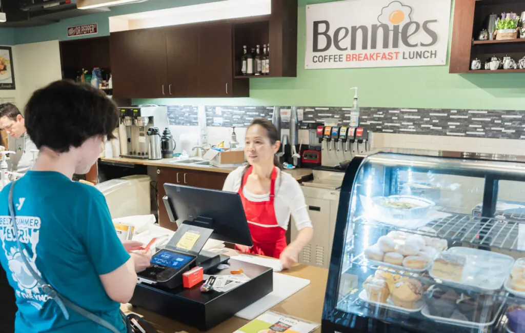
Bennies Cafe
17230 Jackson Creek Pkwy Ste 100, Monument, CO 80132
+1 719-445-0660
FAQ About Cafe
What is considered a café?
A café is generally an informal place to enjoy refreshments and a meal. Bennies Cafe in Monument serves breakfast and lunch in a counter-service setting, with options including eggs Benedict, sandwiches and crepes. Guests can eat in or arrange pickup.
What is the difference between a coffee shop and a café?
The terms often overlap. A coffee shop usually emphasizes coffee and other drinks, while a café may offer a broader food menu. Check the individual establishment's menu rather than relying on its name. Bennies Cafe offers coffee drinks alongside breakfast and lunch dishes.
What is the difference between café and coffee?
In everyday English, a café is a place where people buy food and drinks, while coffee is the beverage. The word café comes from the French word for coffee. Bennies Cafe serves options such as brewed coffee, espresso and lattes as part of its drinks menu.